End-to-End Crypto Market Pipeline & Dashboard
A self-sustaining data system that captures real-time crypto snapshots to analyze market cap distribution and supply-side inflation.

The CA Brain: Why these metrics?
Most people look at crypto prices. I wanted to look at Market Structure. By Comparing the Cirulating supply in the market to max supply possible in the market we can analyze the supply health of that coin along with its liquidity in the market. This also helps us make prediction as to how much time it will take to reach its max supply and how valued the coin is in current market.
Merely showing currency age doesn't provide much insights, by adding the market cap condition to it, we can clearly see that the longer the coin is in the market, the more is its market share.
DAX: Currency Age
The Challenge: Hyper-inflationary Tokens
There were two coins SHIB and PEPE which are highly popular meme coins. They have very high max supply due to which they were distorting the current supply and max supply visualization. Similarly, when I showed market cap by currency bar plot, BTC was distorting the whole plot as it has very high market cap.
To fix this, I used a log scale which doesn't compare the coins in actual values rather makes scales and compares the coins one to another on that scale. This fixed the graphs and other coins were also being able to be showed there instead of being suppressed by more dominating coins.
The Engineering: How it works
I built a modular pipeline using Python and SQLAlchemy for extraction, PostgreSQL for storage, and Windows Task Scheduler for automation.
SQLAlchemy Database Injection
Self-Reading Run Logger
Automation Layer
I used a simple bat script that activated my .venv and runs main.py and then deactivates itself. I automated its running with task scheduler so that it runs automatically every hour my pc is on.
The SQL Flex: Moving Logic to Backend
Creating a VIEW for the Latest Data + (Capped vs Uncapped Coins). This proves I can move 'Business Logic' out of the UI and into the Database for better performance.
SQL VIEW Creation
Interactive Insights Dashboard
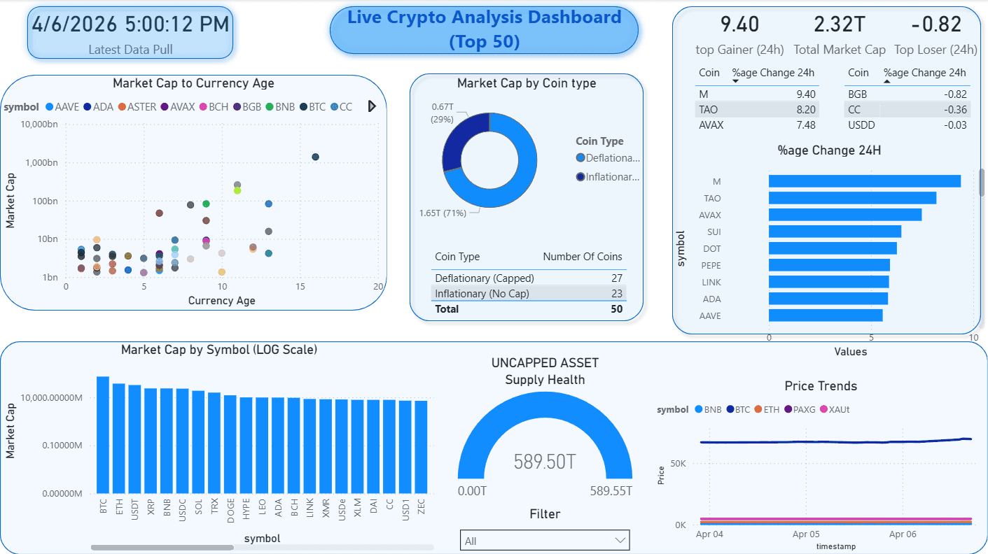
Market Dominance (Scatter Plot)
Click to expand details
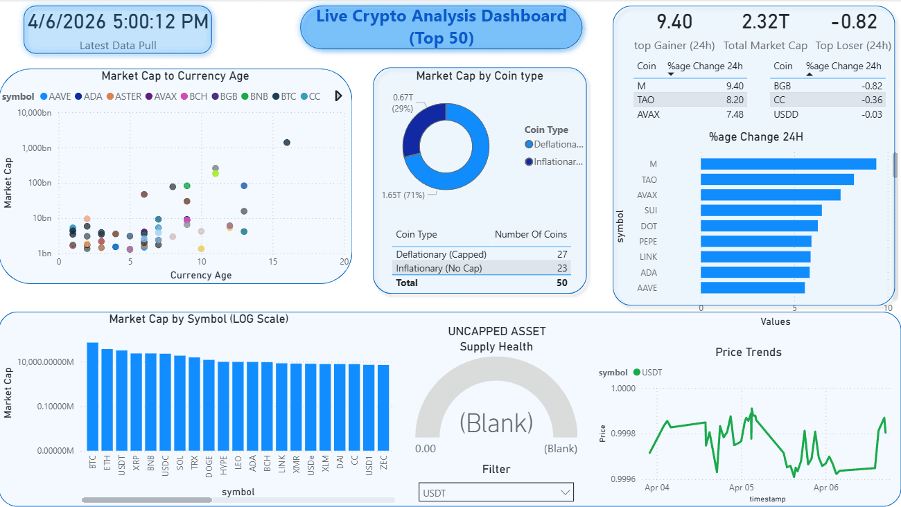
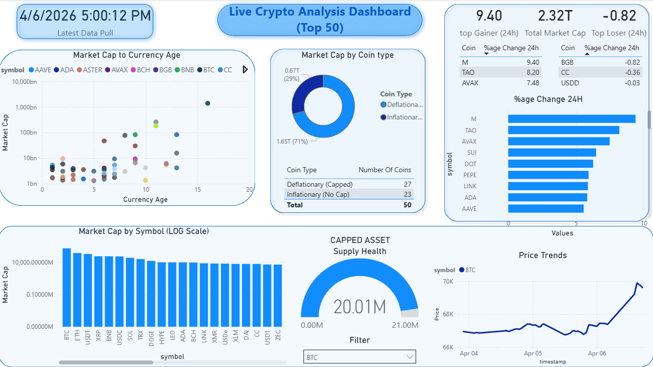
Supply Health (Gauge)
Click to expand details
Top Gainers/Losers
Click to expand details
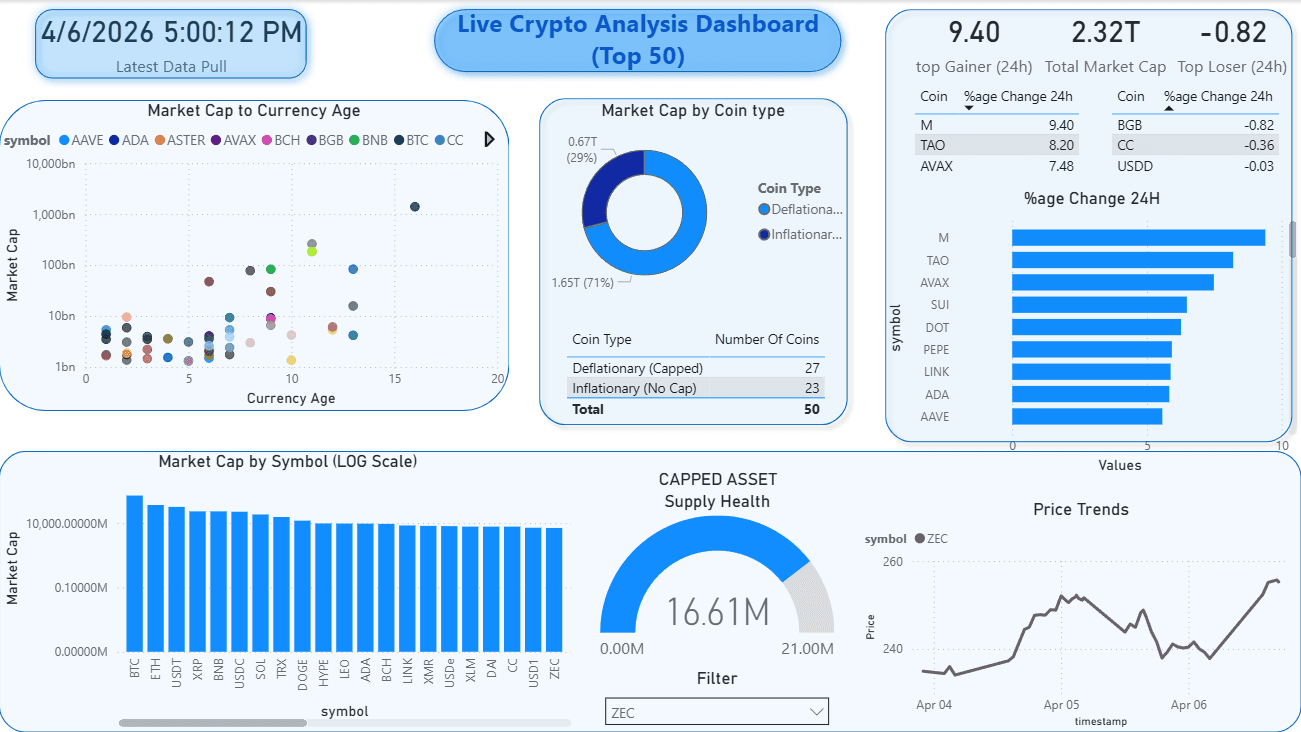
Price Trends (ZEC Example)
Click to expand details
Want to see the raw Python code?
The full ETL logic, PostgreSQL schemas, and Power BI files are available on my GitHub.
Explore Repository